Color Analysis: What Pantone’s Fall Color Trend Report Says About Our Culture In 2018

Color is powerful and connects us to almost everything in our lives, not least of all our clothing.
Every year Pantone releases a color trend report for the following seasons, in accordance with the fashion week shows in New York, London, Milan, and Paris. This means that in February of this past year the company released its Fall/Winter color report after watching trends walk down the runways.
“Fashion informs culture and culture informs fashion, constantly with color at the center of it all.”
Reviews like these can seem outdated, just like the traditional fashion seasons in general, though using color to analyze the state of our country, and ourselves, will never go out of style. Fashion informs culture and culture informs fashion, constantly with color at the center of it all. We attach so much emotion, history, and memories to color without consciously knowing it.
The NY Fashion Week Fall/Winter 2018 color trend report is a fascinating way to look at the condition which our culture is in. The colors in this report reflect back to us our true feelings, as well as the complex times our country is moving through.
“Pantone’s color choices unearth the truth about political turmoil, social anxiety, and our search for identity as a country.”
Pantone’s color choices unearth the truth about political turmoil, social anxiety, and our search for identity as a country, as well as individuals. “To me, what’s most fascinating is that you have two variations of almost every color family,” Pantone’s Leatrice Eiseman noted in Women’s Wear Daily (or WWD.)
There are two sides to every story right now. We are deeply divided and in a serious societal transition. This identity crisis leaves us not knowing how exactly to choose one representation—hence the option for two different shades of each color. This group of colors evokes a sense of happiness on the surface, though there’s clearly discord underneath. Everything’s happy and fine—right?
1. Red Pear
PANTONE 19-1536

Pantone describes this first pick as “deliciously deep red, whose luscious depth entices.” An intense and moody red looks and sounds like a great wine for a dinner party with the character Lady Macbeth. She is at once sensual and sinister in her complex world. Lady Macbeth is a powerful, yet tortured soul and ‘Red Pear’ seems to resemble her role in the play Macbeth through and through.
This shade of red is infectious and charming but dangerous all the same. Empowered by Color reveals that this dark shade “indicates controlled power, determined ambition and dignified action and is often favored by the wealthy.” This color represents a desire, held by many, to obtain fame and fortune. Our country has always been more or less ruled by money and power. However, the rise of the internet and a growing movement towards a more candid culture has made it that much more apparent. Phrases like “get that money” “side hustle” and “treat yourself” are thrown around daily and the shame has been lifted off of the word ambition. Wanting more in life is not inherently bad, yet we have to be careful about how far we take it as individuals and as a country.
2. Valiant Poppy
PANTONE 18-1549
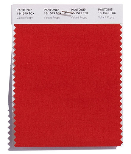
Pantone has labeled this color a “brave and outgoing red shade effusive in its allure.” This bright red is a much more jarring shade than the ‘Red Pear.’ It’s alluring, like Pantone says, and it’s also controversial. This red makes a statement and it makes it loud! Color Matters depicts red as “…the color of extremes. It’s the color of passionate love, seduction, violence, danger, anger, and adventure.” There’s no denying that this color is spirited. Pantone’s pick may be a marked by the intensity of our politics and the resulting protesting. Empowered by Color says that “it excites the emotions and motivates us to take action.” This vibrant hue encourages us to be bold in the face of adversity. Leatrice Eiseman agreed in WWD:
“It goes back to this whole idea of being an individual in your choice of clothing and using a bit more ingenuity and a little more creativity.”
Red can empower us to fight for what we believe in and to speak our minds. However, red can also be used to fake confidence. We can hide behind this shade and use it as a blazing shield.
3. Russet Orange
PANTONE 16-1255

Pantone describes this “forest floor orange” as a color which “speaks to earthen warmth.” This bright rust color may be speaking to the fact that just because we are moving towards a cooler period weather wise, does not mean our lives, politics, or the earth’s temperature as a whole will. This shade seems connect the lighter amber and brooding burnt orange.
According to Empowered by Color, this orange sits amidst the connotations of “confidence and better self esteem” and “pride, tension, and aggressive self-assertion.” We seem to be increasingly walking a fine line between self-empowerment and overwhelming ego. This makes most sense when comparing the color to the self-love movement. It can be an amazing source of confidence and encouragement, or a bridge to selfishness. Another example is the political division in this country. Each side of the aisle argues from a place of sadness and fear, though things turn to finger-pointing in a matter of minutes. Issues escalate quickly, to say the least.
4. Ceylon Yellow
PANTONE 15-0850
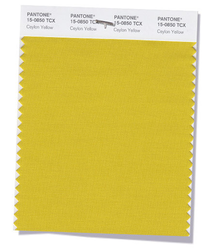
Pantone explains this shade as a “savory and spicy yellow” which adds “an exotic touch.” Yellow in general is associated with acquired knowledge and represents the logic (or left) side of the brain. Pantone’s comment about an “exotic touch” seems to be a nod to the ever-growing globalization in this world. We are more consistently sharing images across the world and this turmeric-esque color represents the connection we have to cultures so unlike our own.
This version of yellow does feel cozier than some of the other colors and makes the visual transition to fall more believable. However, it’s also a bit uneasy. Empowered by Color describes this darker hue as having an air of melancholy and that it “relates to the constant complainer and the cynic.” While it’s wonderful that we are more connected to the world around us, the constant barrage of content can leave us all feeling overwhelmed.
5. Limelight
PANTONE 12-0740
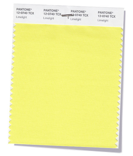
Pantone describes this shade as “animated and effervescent…pungent yellow-green becomes the center of attention.” The name alone of this Pantone pick is extremely telling. Our Western culture seems to be at peak obsession with celebrity nowadays. Social media has created a world where it doesn’t take much to gain some amount of celebrity and we’re more involved in big star’s lives than ever. This color screams for attention but might not actually have much to say in the end. The other colors are far more rich in symbolism, but it’s hard to take your eye off the bright hue. Our culture has an addiction to shiny things and we’re easily distracted. Empowered by Color seems to agree with this analysis:
A superficial and fickle color. It encourages the serial relationship hopper, the teaser, with unstable emotions. This yellow can be deceitful and retreats from responsibility.
6. Quetzal Green
PANTONE 18-5025
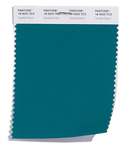
Pantone details this color as “a deep elegant blue-green hue suggestive of rich plumage.” This color seems to allude to the similar shade used to establish the women’s suffrage at the turn of the century. WWD drew parallels from women’s suffrage to today which makes this color all the more intriguing.
“In light of female musicians at the Grammys’ decision to carry white roses and actresses at the Golden Globes standing together in black gowns, Eiseman noted the suffragettes used color as a sign of solidarity years ago (all three of their choices — white, purple and green — cropped up on the fall Top 10 list).”
Back then, the color was used because green is a symbol of hope, however, it’s not the bright green shade which is most often associated with that. The somewhat calmer-on-the-surface color possibly implies a stand against naivety—we know the things we are fighting for right now are difficult to achieve, there’s no denying that. Empowered by Color describes this blue as a color which “signifies trustworthiness and reliability. It promotes spiritual advancement and commitment.” On the other hand, it could be also representing our desire to appeal to a wide audience while still taking a stance on important issues. It’s making a choice but not a completely clear or strong one. No doubt it’s a beautiful color but what is the real message behind it?
7. Nebulas Blue
PANTONE 18-4048
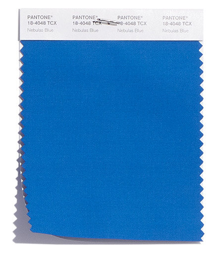
Pantone adds this color to the mix as “reminiscent of twilight, a thoughtful, starry-eyed blue.” This almost stereotypical blue stands out as the most solid and uncomplicated color. Although this color seems to be the tamest of the bunch, it makes a statement by being just that. Empowered by Color states that blue represents honesty, peace/calm, authority, communication, religion, and wisdom.
“This color is one of trust, responsibility, honesty and loyalty. It is sincere, reserved and quiet, and doesn’t like to make a fuss or draw attention. It hates confrontation, and likes to do things in its own way.”
The US is going through a transition in many ways. Our country often feels like it’s finding its way in the dark and we all long for a guiding light. Blue represents that steadfast leadership we crave right now. During a time when it’s hard to tell fact from fiction, ‘Nebulas Blue’ is there to tell you the truth.
8. Ultra Violet
PANTONE 18-3838
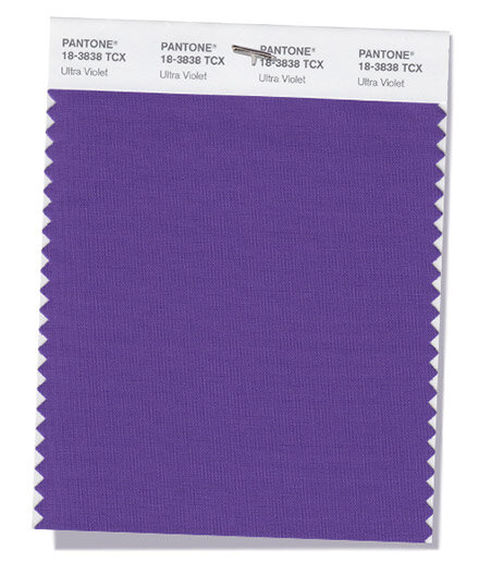
Pantone chronicles this pick as “inventive and imaginative,” and a color which “lights the way for what is yet to come.” Purple (or Violet) is the most clear marriage of two colors in our arsenal. Empowered by Color defines it as “the union of body and soul creating a balance between our physical and our spiritual energies.”
Purple is used to describe states in the US which are not overtaken by just one party, it’s the middle ground. There are infinite possibilities to defining what this color means, what our collective thoughts and dreams are, and where our country is headed. It’s a color that gives us permission to dream of possibility instead of drowning in dread. “Ultraviolet, the color of the year, is a color of complexity and we live in complex times,” Leatrice Eiseman told WWD. Purple is often associated with creatives and is the second suffragette color. This hue represents strength in softness.
“The color violet relates to the fantasy world, and a need to escape from the practicalities of life. It is the daydreamer escaping from reality. The color violet inspires unconditional and selfless love, devoid of ego, encouraging sensitivity and compassion.”
9. Crocus Petal
PANTONE 15-3520
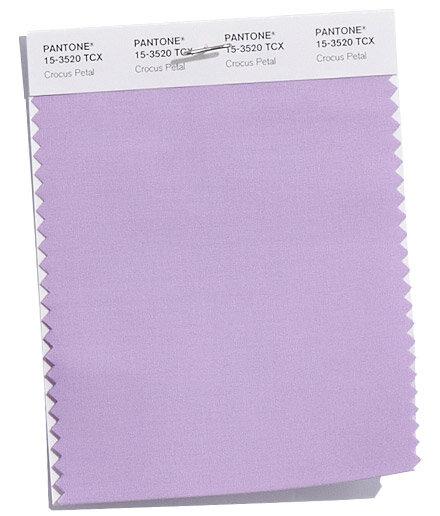
Pantone characterizes this color as “a cultivated and refined hue” which adds a “light and airy spring-like feeling demand.” The second most out-of-place color is this lavender-like shade. It brings to mind Spring instead of Fall, yet has been put there for a reason.
This year has been tough politically, socially, and environmentally—maybe we don’t care that fall is traditionally the season for diving deeper into what we already have, we want a sense of rebirth and we can’t wait until spring to be surrounded by it. We desire a moment to escape, to feel light, and drift into a dream of a better tomorrow. The Pantone pick is the symbol of our changing society, towards more gender-neutral generations and styles. Empowered by Color reports this light lavender color as being “attracted to beautiful things. It has a fragility, sensitivity and vulnerability to it.” Vulnerability has become somewhat of a buzzword the past few years and discussing our own struggles frees up space for others to do the same. ‘Crocus Petal’ lights the way as we search for more transparency in our lives.
10. Martini Olive
PANTONE 18-0625
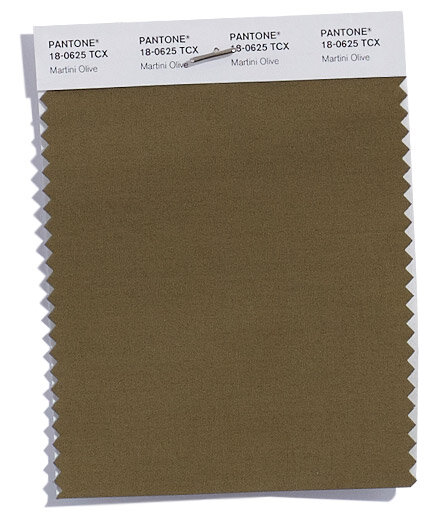
Pantone’s darkest pick is described as a “smooth, sophisticated and urbane green” which “adds depth to the Fall/Winter 2018 palette.” My absolute favorite color name of the bunch is this one. Without any visual I can imagine the shade perfectly. It’s gradually getting colder, cozier, more romantic, and we’d like to share those moments with a special someone—or a good adult beverage. A martini also tends to be a symbol of sophistication and we are desperately craving some maturity in our lives right about now. WWD commented on the color’s connection to modern life”:
Three martini lunches are long gone, but cube dwellers, outdoor enthusiasts and Silicon Valley leaders are all-in with this understated, versatile, sophisticated neutral.
Empowered by Color takes this notion further and categorizes it as “materialistic yet prudent,” which seems to sum it up perfectly. This color is “a serious, down-to-earth color signifying stability, structure and support.” Eiseman even described it as “grounding.” However, it is also “suggests deceit and treachery, blaming others for its problems.” Depending on the day, ‘Martini Olive’ could be a solid rock, or full of contempt. Our culture seems to be stuck in the middle of these two states currently, attempting a transition into more stability, but still peddling petty ways. We have a lot to get done and not a lot of time to waste. Drink up darlings!
In the end, this combination of colors reveals a fascinating look at the current state of our Western world. It doesn’t mean that we’re committed to these extreme characteristics or if we wear certain colors that we embody that description—this is just a way to observe our culture right here, right now.
The color trend report encourages us to take a moment to step back and evaluate what is really going on in our culture. A little perspective gives us the motivation to press forward in a productive, and hopefully positive, way. Color analysis can seem harsh at times, but if you don’t take it too personally, it can be an amazing tool to learn a little be more about yourself and the world around you.
“A little perspective gives us the motivation to press forward in a productive, and hopefully positive, way. ”
Audrey Stanton was born and raised in the Bay Area and is currently based in Los Angeles. She works as a freelance writer and content creator with a focus in sustainable fashion. Audrey is deeply passionate about conscious living and hopes to continue to spread awareness of ethical consumption.